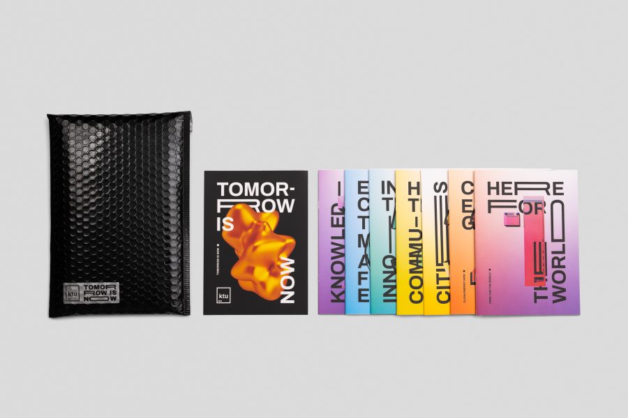
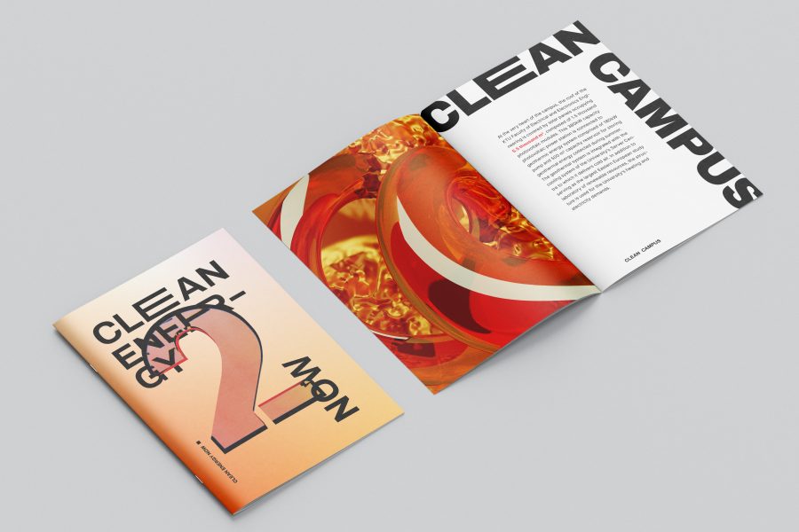
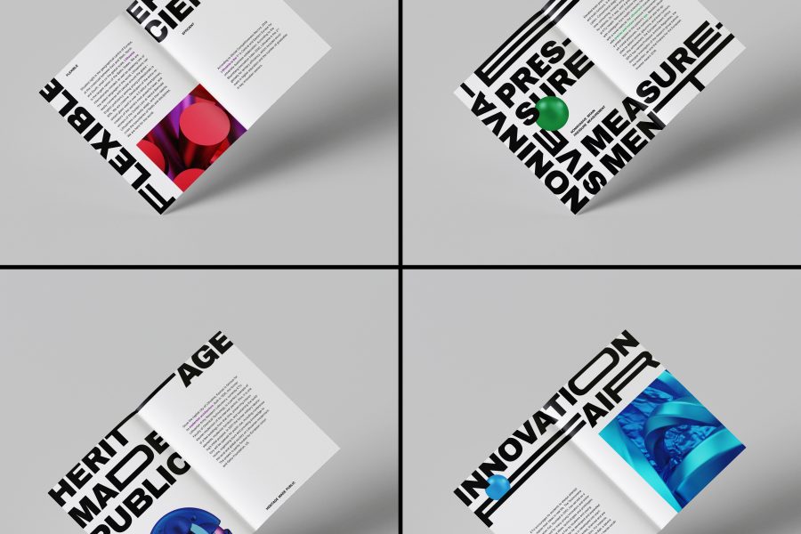
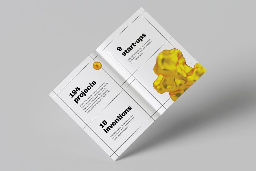
SITUATION After updating the visual identity of Kaunas University of Technology (KTU), we were asked to design a brand-new representative publication. Texts were created by Aldona Tüür, who was able to turn serious topics KTU researchers and students are working on into clear messages. We aimed to develop a beautifully designed publication that conveyed scientific innovations and corresponded to the rules of the KTU brand book. SOLUTION Rather than creating one publication, we split seven topics regarding clean energy, sustainable cities, industry innovations, and other scientific and academic matters into small booklets. It allowed us to tailor the colors and unique 3D visuals for specific issues and unify them by boldly using the font as a graphic element. In regards to the global pandemic, which prevented hand-to-hand sharing of such publications, we chose black cushioned mailers as means to safely and conveniently distribute it by mail. The color black absorbs all wavelengths of light, thus acting as a symbol of the wholeness of the university's scientific approach when solving global challenges. It balances the color specter utilized in the booklets, which indicates the diversity and flexibility of various professionals working for the same goal.
